No Products in the Cart
I spend a lot of time looking at record labels. Some are beautiful. Some are meh. Some are butt-ugly. This blog is about those ones.
1. Late 60s Canadian Atlantic

Atlantic records pressed in the UK spent the late 60s sporting the attractive "plum" labels that were a twist on the US mono labels of the 60s. In 1968, American Atlantic pressings started using the banded green and orange labels that went on to become standard for Atlantic releases around the world. Why then, why in GOD'S name did the powers that be decide that Canadian Atlantic releases were only worthy of the ugliest, most poorly thought out label design imaginable? It takes the standard 60s Atlantic design with the company name on the left and the logo on the right, and rather than employing any elements of design, it looks like they had someone with the bubonic plague cough up half a cup of blood all over it. It pains me that so many classic albums released in my adoptive home country bear this atrocity. Unforgivable.
2. A&M Records Audiophile Series

Keeping it Canadian, A&M's Audiophile Series were introduced in 1978. These were half-speed masters pressed on virgin vinyl in Japan, which were imported and then packaged in Canada. Just 27 albums were released between 1978 and 1982, all popular current acts like The Police, Supertramp and Styx. The album covers all had an unattractive yellowy-brown border around them, and the word "Audiophile" across the top in a font chosen by somebody who deserves to have their testicles shaved with a rusty farm implement, dipped in Frank's Hot Sauce and plunged into a tank of ravenous piranhas. The label features the same font for "Audiophile" emblazoned across it, with A&M's logo behind it in a gaudy yellow. The whole thing is vomit-inducing. My first and last experience of this label was a pair of Police LPs I bought from this series. They sounded good enough, but the label (and sleeve) design were so ugly I couldn't bear to have them in my collection, so I returned them.
3. UK Island circa 1980

This one really stings. The original Island labels are iconic. The pink label went through three iterations between 1967 and 1970, and then they used the equally iconic pink rim/palm tree label until 1975. The "sunset" palm tree labels that ran through the late 70s were beautiful too, and featured on their share of classic albums. So what in the name of fuckery were they thinking when some hapless moron green-lighted this monstrosity? This is sometimes referred to as the "Barney Bubbles" design and it's one of the busiest and most unappealing label designs of all time. I get vertigo just looking at it.
4. UK Epic, late 70s

Epic label designs are across-the-board uninspired, from the all-yellow design you'll recall from the 60s and early 70s to the 80s black-into-blue sunburst with the shitugly logo, but it's the late 70s all-orange target design that really scales the heights of poor design. The US equivalent from the same time period gives this one a close run for its money (the logo is so inconspicuous it’s almost invisible), but at least on the US label, the concentric circles are spaced evenly from the centre hole to the rim, giving some semblance of uniformity. What the fuck was this designer thinking?
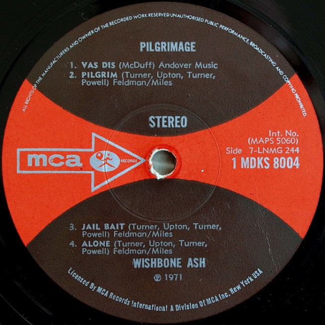
5. US MCA, late 70s

MCA are another label who consistently phoned it in when it came to label design. The various configurations of "dogbone" designs in the UK that seemed to deliberately match ill-suited colours (red and pink!, lilac and orange!, brown and red!) graced many classic albums by Wishbone Ash, Osibisa and Budgie, and their ubiquitous late 70s/80s label design with the rainbow emanating from the centre of the label was uninspired in its own unique way. But it's their late 70s US label design which truly plumbed the depths of blandness. How many people unsuspectingly bought a record with this label design, took it home, pulled the record out of the inner sleeve and thought "Wow!...how can a record with such a tedious label contain any music I might want to listen to?", only to put it back in the sleeve and bury it on the shelf, never to be played.
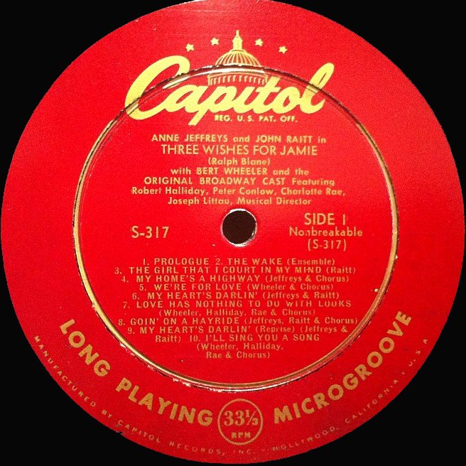
6. US Capitol, 1969

The original Capitol label design of the 1950s was fairly classic with the dome logo design atop the classic Capitol font. The 60s iteration with the black label encased in the rainbow rim, while unexciting, wasn't altogether unpleasant. Which brings us to their late 60s design. I realize the drugs were of a remarkably high quality in those days, but how off their tits would this designer have had to be to submit this to the Capitol bigwigs, declaring it to be his finest effort. And how off their tits were the Capitol execs that they looked at this technicolour yawn and said “YES! It’s perfect!”. The mind boggles.
7. Cotillion, late 60s/early 70s

This is a deeply ugly label. The marbled background doesn’t bode well to begin with, the mixtures of clashing fonts are a real dog’s breakfast, but the boxed logo with the yellow background is the cherry on this particular shitcake. Let’s put a border around it! NO, let’s put FOUR! For me, the ugliness of this label is often imbued with disappointment. I’ve lost count of the number of times I’ve pulled out a copy of a classic Emerson, Lake & Palmer record while buying stock in the UK, fully expecting it to bear Island’s classic UK pink rim label, only to find this monstrosity in my hands. It never gets easier.
8. Atco US, late 70s/early 80s

As a subsidiary of Atlantic, Atco should have known better, but their label designs were consistently eye-watering. The design before this was considerably vulgar - the all-yellow label with the Atco logo on the left side beneath the most counter-intuitive colour-wheel ever designed. And the design after this one was proper revolting too, but in the end I had to choose this one for its unique pairing of monotony and lack of design acumen. It’s truly breathtaking.
9. Arista (late 70s – mid 80s)

The hideous Arista label design of the late 70s takes its inspiration from the equally-hideous logo, designed to look like a monolithic pyramid blasting through space. It’s like a scene from a kitsch sci-fi movie – a sky full of shitty Arista logos descending on you to the tune of Barry Manilow’s Bermuda Triangle. Even just seeing a picture of this record label leaves me with the feeling that I need a shower.
10. Westbound

A lesser-known label compared to the rest of the companies on this list, but perhaps I’ve saved the best for last. A Detroit-based soul label that launched Funkadelic and the Ohio Players, apparently company founder Armen Boladian was driving westbound on 8 Mile Road one day in 1968 when the label’s name came to him. Harder to explain is the inspiration behind this nightmarish scene, the rocket-like arrow shooting westbound, farting out a mixture of puss and blood clots behind it, the logo which looks like a mummified teddy bear, and the white-lined sea of blue because god forbid you could have any negative space on a record label - and goddammit, this designer was in for a penny, in for a pound. By comparison, Westbound’s sister label Eastbound used a design based on this that was almost palatable.
:format(jpeg):mode_rgb():quality(90)/discogs-images/R-1218217-1532055519-4222.jpeg.jpg)
:format(jpeg):mode_rgb():quality(90)/discogs-images/R-14177324-1569310210-5650.jpeg.jpg)
:format(jpeg):mode_rgb():quality(90)/discogs-images/R-10616650-1501171890-1833.jpeg.jpg)
:format(jpeg):mode_rgb():quality(90)/discogs-images/R-2082682-1583595137-4263.png.jpg)
:format(jpeg):mode_rgb():quality(90)/discogs-images/R-467112-1258033645.jpeg.jpg)
:format(jpeg):mode_rgb():quality(90)/discogs-images/R-607103-1469571626-7026.jpeg.jpg)
:format(jpeg):mode_rgb():quality(90)/discogs-images/R-604929-1148549375.jpeg.jpg)
:format(jpeg):mode_rgb():quality(90)/discogs-images/R-1017024-1184474972.jpeg.jpg)
:format(jpeg):mode_rgb():quality(90)/discogs-images/R-15051980-1586030160-8502.jpeg.jpg)
:format(jpeg):mode_rgb():quality(90)/discogs-images/R-7997355-1454101345-7789.jpeg.jpg)
:format(jpeg):mode_rgb():quality(90)/discogs-images/R-7047185-1522887925-2418.jpeg.jpg)